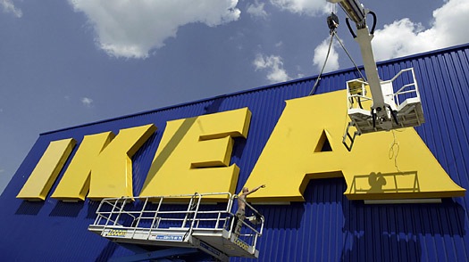
Thumbing through his local Swedish newspaper, Göteborg resident Mattias Akerberg found himself troubled by a full-page advertisement for Ikea. It wasn’t that the Grevbäck bookcases looked any less sturdy, or that the Bibbi Snur duvet covers were any less colorful, or even that the names given to each of the company’s 9,500 products were any less whimsical. No, what bothered Akerberg was the typeface. “I thought that something had gone terribly wrong, but when I Twittered about it, people at their ad agency told me that this was actually the new Ikea font,” he recalls. “I could hardly believe it was true.”
[From The Font War: Ikea Fans Fume over Switch to Verdana – TIME]